134_p2_brown-toganivalu-sarah_vid01_2010
Tuesday, October 12, 2010


Friday, October 8, 2010
Edited movie [final cut pro]
I have decided to call my movie 'playful chaos' which i think fits in with the actions and playfulness of the movie.
Thursday, October 7, 2010
Practice Movie, using final cut pro
This is a practice of getting my movie into a movie making programme, at the moment i am happy with the music and how it is timed with the movie, but im not happy with the quality of th picture, maybe a setting is not quite right within final cut pro.
Tuesday, October 5, 2010


adding colour changes

To make the scene more fun and playful, i added the gradient colour changes in fun colourful tones


Monday, October 4, 2010


.jpg)
Tuesday, September 21, 2010


100 words
The Concept for my design is derived from the qualities of children's toys, especially building blocks and kaleidoscopes, I was really inspired by the ability of blocks to build up upon one another and to also slide through , spin , and move in all sorts of directions. And also how kaleidoscopes can change colour and shape configurations by just adjusting its arrangements. I will translate this concept throughout my movie by using the qualities of the toys and kaleidoscopes to create a fun, playful environment that shows no limits, I will also use the shape of a triangle to create these effects, and I will keep the colours fun and playful so the environment allows you into a world that sparks imagination.
Sunday, September 19, 2010


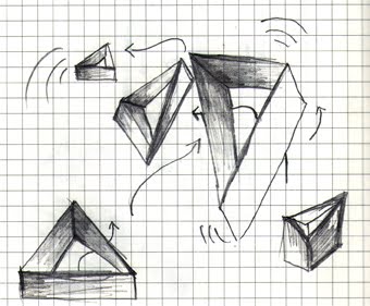
Sketch up development

Im now looking at really changing the sizes of the triangle blocks, so there is more depth within the image. The triangles on the left are about 3 times smaller than the others.
Thursday, September 16, 2010
Image three
I really like this image, I changes the shininess of the blue texture within the shapes, It gives off a more glowing feel, and make the image look more interesting, it also corresponds to my inspiration of fun building blocks, as this image has more of a fun feel, the background is also interesting as it takes the shapes way more out of context and gives a more dream like feel.

image two
In this image I have changes the colours to black and white, which i thought would bring out the contrast more and make the image more interesting. It seems that the black is a bit dominant thought and it could also be more transparent. Other than that i like the light blue background, i think it works well because it continues with the floating feel, like the shapes are up in the sky.

Image one
I like this image, because it corresponds to one of my original sketch ideas that i came up with. chose two colours to really bring out a contrast between the triangles. Having the background white give s the image a floating feel and doesn't put the shapes in context, which is what i like.

inspiration
These are a couple of images which caught my attention, i like the idea of fun, building blocks that have the ability to build up on top and through one another, also spinning tops and kaleidoscopes because of the colour blends that come out of the action of spinning and moving.

Test HD render
I don't think this image is very successful because its still very distant , and doesn't inhabit the viewer enough.

Tuesday, August 31, 2010


Thursday, August 26, 2010

Wednesday, August 25, 2010


Wednesday, August 11, 2010


Tuesday, August 10, 2010

Monday, August 9, 2010


Subscribe to:
Comments (Atom)